Hate-sharing
Not every messy social media graphic is evidence of a conspiracy
My phone pinged just moments after I sent the tweet. In the febrile world of Westminster, London’s heart of Britain’s political scene, all actions have consequences. Everyone is watching everyone else. Red Throat was watching me. “Meet me in half an hour”, he texted. “I’ve got something to show you”. I gasped.
Red Throat had been close to the centre of power in the Labour Party for decades. More powerful than some people you’ve heard of. More dangerous than some people you haven’t. Some said he had brought down Iain Duncan Smith. Others said that he was the reason Labour won the 2011 Barnsley Central by-election. All I knew was that I was afraid of him. And yet drawn to him like a moth to a cliché.
As we sipped our too-warm champagne in The Speaker, a trendy wine-bar in the febrile heart of London’s Westminster, Red Throat looked me straight in the eye. “You’re on to something”, he said. “You’re getting close to a huge secret nobody wants to talk about”. He looked around, making sure no spads or journalists were hiding in a dark corner, listening in. “It’s true that we tweeted a really rubbish graphic. But…” He paused. I looked him straight in the eye. He raised his champagne glass. I had to strain to hear the next thing he said, a low whisper. “That was the point”.
OK. There’s only so long you can carry on with this kind of Nadine Dorries pastiche, not least because of the risk that new readers (welcome, and thanks for subscribing!) won't recognise it and will just think I write like this all the time and give up. But sometimes there are good reasons to put out bad material.
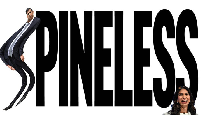
Take, for example, this graphic, which Labour put out last week and which I really did tweet about at the time.
This isn’t great. It’s kind of funny, but partly because it’s cheap and messy. It looks like something I could have managed to do myself (this is an exceptionally cruel thing for me to say, and to be fair to Labour’s graphic designers I could not in fact have managed to do this myself, although this is mostly a reflection on me rather than them). This judgement is shared in some of the reaction to it on social media. Comments include “Please Labour, I'm begging you, with tears in my eyes, hire better graphic designers”, “This is…. not good”, “When your FBPE dad discovers photoshop”, “Strong "graphic design is my passion" vibes”, “Someone lied on their CV” and so on and so on.1
There is a defence of this based on two points. First, everyone who is sharing the graphic is amplifying the message, even if their intention is to point and laugh. More people will see it than otherwise would have done. At the time of writing it has 1.8 million views, over 1,600 retweets and 647 quote-tweets, which is nothing compared to a moderately successful tweet on, say, football or K-pop but is not bad at all for politics. And second, for all its faults as a piece of graphic design it is absolutely, rigorously on-message, and the message is a good one. Rishi Sunak is weak, it says. He’s too weak to sack Suella Braverman, just as (as they argued with a previous graphic which I discussed in an earlier edition of this newsletter) he’s too weak to stand up to Liz Truss. That’s the core of Labour’s current characterisation of Sunak, the one thing they’d like you to think about him. It’s a message they want as many people as possible to see.
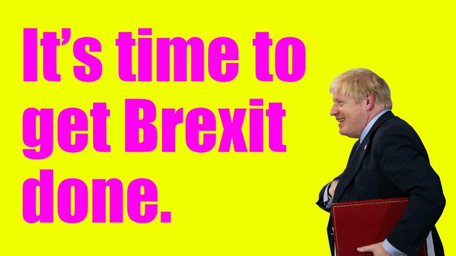
So is this deliberately rubbish? There’s precedent for parties creating terrible campaign materials on purpose - so terrible that if you saw them, you’d want to show your friends. In the run-up to the 2019 election, the Conservatives developed a line in really lame graphics, like this one:
and this one:
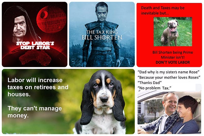
These are eye-hurtingly terrible, but - crucially - they contain nothing apart from what was then the Tories’ central strategic message. Anyone sharing them to mock the terrible graphic design was also bringing the Tories’ central strategic message to a wider audience. Now, obviously these graphics aren’t what won them the election. But graphics never are, and that doesn’t mean they didn’t help. They were reportedly the work of the digital marketing agency Topham Guerin, hired by the Tories in 2019 after their work for the Australian Liberal Party in their successful election campaign earlier that year. Their tactics there included the use of what they called “boomer memes”: graphics that were “really basic and deliberately lame because they'd get shares and lift our reach”. Here are a few of them:
There’s no real doubt that for those Tory graphics in 2019, the poor quality was part of the point: it drove hate-sharing, and amplified the message. In some other cases where the graphic design is quite basic and at least some of the reaction is negative, though - and I think Labour’s “SPINELESS” graphic is one - driving hate-sharing may be a by-product, but it isn’t the point.
Now that the idea of making deliberately bad graphics so that they will be spread widely by people who just want to mock them is out there in the public domain, it becomes an all-purpose retrospective - and slightly conspiracist - justification for the existence of accidentally bad graphics. If you’re not careful, once you know about Topham Guerin and boomer memes, you can end up concluding that there’s no such thing as a bad political social media post because either it’s good because it’s good or it’s good because it’s bad. But… there is such a thing as a bad political social media post. The bad ones fail to communicate a message that a political party wants to get across.
There’s a difference between coming up with a quick-and-dirty response to a breaking story (the “SPINELESS” graphic was out before lunchtime on the day Suella Braverman’s controversial Times op-ed was published, which is about as quick as anyone can reasonably expect) and having a strategy of trying to get people who hate you to amplify your material by making it worse than it needs to be.
This one really does get the strategic message right. It’s messy, and I don’t much like it, but it does the job. And while above I quoted some of the critical and mocking quote-tweets, it’s worth remembering that a lot of people appear simply to have retweeted it, sharing it without criticising it at all. Some people are sharing it because they hate it. Labour can live with that. A lot more people are sharing it because they like it. The message is what matters. Red Throat may think the graphic being rubbish was the point. But I’m not convinced Red Throat is real.
I haven’t read Nadine Dorries’ book, and I doubt I ever will. But I’ve seen plenty of it shared on social media, and in some very funny reviews (I particularly recommend Rob Hutton’s, here, and Patrick Maguire’s, here), and in WhatsApp messages from a brave friend who’s dared to give it ago. The screenshots and quotes I’ve seen have been shared to mock her, not to amplify her thesis. Dorries didn’t write her book so that people would laugh at it. But her message is an incoherent mess. When your message doesn’t make sense, it doesn’t matter how many people share it. When it does, it doesn’t matter why they do.


